The Helpdesk Pilot dashboard is a thing of beauty. At any given minute, you can checkout the key metrics of your support process from a bird’s eye view. From ticket inflow to status and priority, things that matter are presented in a visually sumptuous format. Consider this the vital stats of your support team over the past week and it’s perfect for arriving at business decisions on the fly.
But, most of us need to do more with our data. Mixing and matching various sets of data might end up offering valuable insights about the state of the support infrastructure in place. We understand the concern, and that’s the reason we have built the ability to pull custom reports in Helpdesk Pilot. 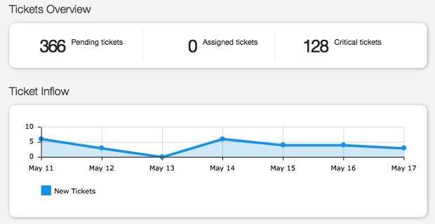
Custom reports offer you a variety of ways to put multiple data points together and come up with charts and graphs, which then end up enlightening you about interesting trends that otherwise might have gone unnoticed.
After logging into your Helpdesk Pilot account, head over to the Reports section. Name the report appropriately and you can even add a brief description explaining what this report is all about for other users of the Helpdesk Pilot account.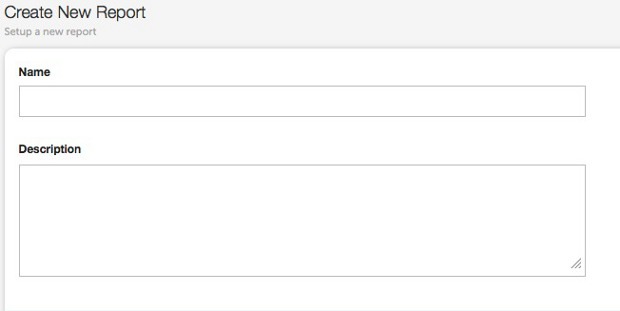
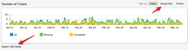
Now, we come to the interesting part of the reports section – adding Data Sources. Every single aspect of the ticket is up for closer inspection. Not only that, Helpdesk Pilot also allows you to add the custom fields you have created so far to be used as well! Besides, you can add multiple data sources and collate all the data together in any manner you please.


That isn’t everything. The table view at the fag end of the page offers equally compelling information too. Toggle between the views and you will be surprised to see some juicy nuggets of information from the data sources you are analyzing. 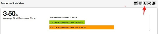
Response Stats and Staff Performance views are two of my favorites! In the coming day, let us explore more about each of the views in detail.
What’s your thought on the Custom Reports feature? Got any suggestions to make it better? Sound off in the comments section!